MA Allen
Luxe and Layered Study
MA Allen, MA Allen Interiors
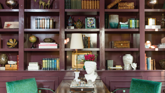
This bright and bold study perfectly reflects her signature style, says designer MA Allen, and became an instant favorite. Her approach marries fashion and function to create a vibrant, collected look that’s practical for a family. Gone are the days of large desktop computers set on massive desks; most families prefer laptop computers or tablets.
“I wanted this to be a study that will actually be used. Combining part seating area and part desk was really designing for a purpose,” Allen said. “The room is very warm and a great place to sit and break away from a bigger crowd.”
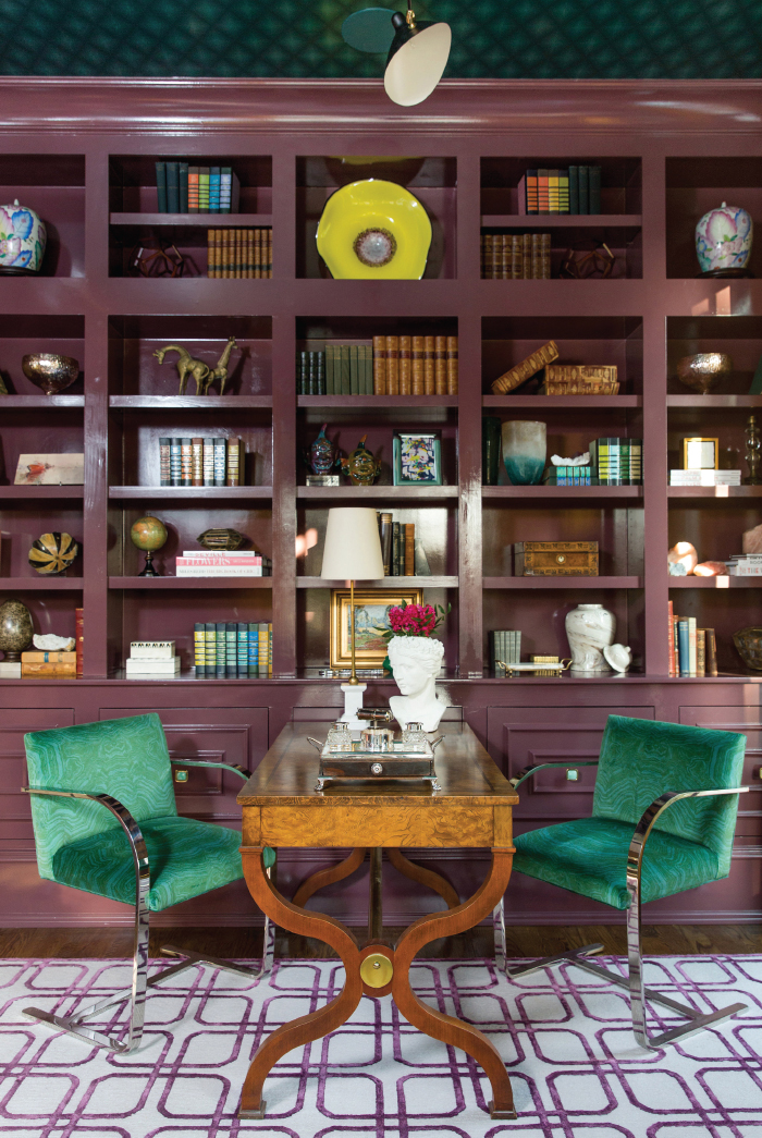
A vintage regency-style desk and Brno chairs stand out against burgundy lacquered walls in this study designed by MA Allen of MA Allen Interiors.
Allen favors classic styles and doesn’t follow trends. She adds unexpected pops of color and vintage furnishings to make her spaces one-of-a-kind. Here, burgundy lacquered walls provide a bold base to layer with plenty of color and pattern. A vintage desk and newly covered Brno chairs supply the quintessential office furniture, but in a fresh and intimate way.
“The study is about 60 percent vintage pieces and 40 percent new,” Allen said. “Having a lot of one-of-a-kind items is very important.
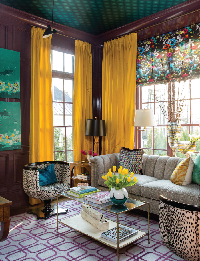
A master of fearless layering, MA Allen says confidence propels her bold style.
“In the past few years I’ve gained a lot of confidence in my first instincts,” she said. “My design style has become more bold because of that confidence level. If you love it, go out on a limb and go for it.”
Steal this style
Go bold with unexpected color. “If you love it, I think you’re always going to love it,” Allen says.
Mix new and vintage furnishings and accessories. “Every space should have something old and something new, so you don’t look at the room and recognize everything.”
Wait for the pieces you truly love. “If you can’t afford something you want right now, plan the whole room and complete it phase by phase, rather than rushing to fill it.”

Lisa Allen
Light and Bright Bedroom Transformation
Lisa Allen, Ivy Cottage Collections
“This home was designed by Bob Timberlake, a famous North Carolina artist known for his Arts and Crafts lodge style,” said designer Lisa Allen, no relation to M.A.
The bones were beautiful, but the characteristic dark wood, leather and heavy materials needed lightening up.
The transformation from a moody mountain lodge to a fresh and modern sanctuary puts this bedroom atop Allen’s all-time favorites.
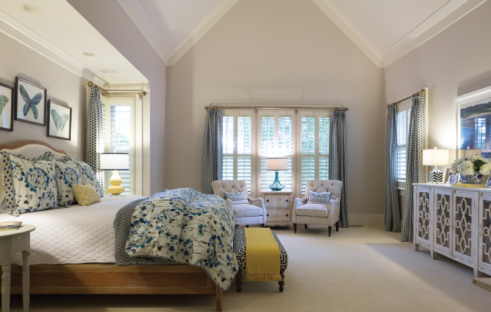
Transformed from a dark lodge to a comfortable and bright haven, designer Lisa Allen considers this client’s bedroom one of her favorite spaces. Photo by Jonathan Fredin.
“A challenge was making sure the style didn’t fight the tone of the home,” Allen said. “But the homeowner wanted a style that was more hip and contemporary. It was great fun to do that.”
Easy elegance became the decorating mantra, and colorful artwork, linens and a much lighter color palette paved the way.
“We were attracted to pieces with antique or worn finish and wanted everything to be warm and comfortable,” Allen said. “We also made sure everything was kid-friendly, because grandchildren are an integral part of the homeowner’s daily life.”
Developing a close friendship with the homeowner, Allen frequently brought pieces she loved straight into the Morrisville home, knowing the two would work together until the space was just right.
“It can be harder for the client, because they have to see everything piece by piece,” Allen said. “I’ve already got the room in my head.”

Vicky Serany and Martha Brown
Naturally Timeless Keeping Room
Vicky Serany and Martha Brown, Southern Studio Interior Design
“Layer upon layer of texture,” said designer Vicky Serany, describing a Raleigh keeping room that sits atop her favorites list.
Wood, metal, stone, glass, leather and fabric all appear in the space and add to its warm, sophisticated atmosphere, she says.
“We really worked with this client to layer a lot of texture without a lot of color. Texture gives you the visual interest,” Serany said.
The stone feature wall became the room’s centerpiece and beautifully showcases colorful art by Apex artist Susan Hecht. Originally hanging on Serany’s own dining room wall, her clients loved the painting so much they didn’t want to give it back once they saw it over their own mantel.
“The way the room opens up into the kitchen, it’s just such an inviting space for a family to gather,” Serany said. “Which is why we love it.”
With that in mind, Serany and Brown added swivel arm chairs — one of their favorite furnishings — that can be angled for conversation or for television.
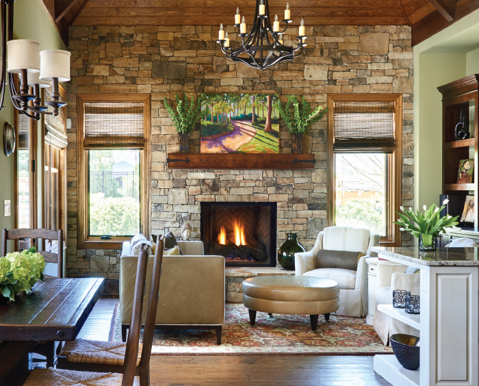
Sophisticated layering, natural materials and timeless style make this keeping room a favorite of designers Vicky Serany and Martha Brown.
The home’s design was completed in 2013, but the neutral color palette and classic elements are timeless, and still a Southern Studio favorite four years later.
“Sometimes when it’s fresh photography we think about what we should have done. The older (our projects) get, the more we see the beauty of them,” said Serany.
Steal this Style
Establish a color palette.
The rug and the stone dictated this color palette, Serany says.
Showcase the home’s architecture. Wooden planks highlight an open ceiling and the stone wall showcases the fireplace. Custom niches and trim details appear throughout the home.
Build interest with layers of texture. Serany highlights subtle details like the iron strapping on the mantel used to echo the metal chandelier. “Repeating those elements always helps unify a space,”
she says.

Donna Davis and Catlin Darner
Attic Overhaul
Donna Davis and Catlin Darner, Design Works Studio
Designers Donna Davis and Catlin Darner agree that the transformation of an unfinished attic into a temperature-controlled wine room and lounge was a uniquely challenging project. Overcoming those challenges turned the space into one of their favorites.
“Working with the shape of the room was a huge challenge,” said Darner, as the Fuquay-Varina home’s roofline dictated the available space. “It was fun for me trying to figure out what we could do, what I could find to put in there — a challenge you don’t get very often. We really had to be creative.”
Wine rooms are often dark and intimate cellars, but Davis, Darner and the homeowners wanted a modern twist for the renovated attic. Natural materials like cork flooring, grasscloth wallpaper and granite countertops, and carefully chosen lighting, create a California casual vibe: comfortable and bright with a hint of rustic for balance.
“It was all simple and understated,” Davis said. “But they all play off of each other.”
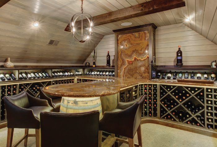
A backlit onyx countertop is the focal point of the temperature-controlled wine room. Photo courtesy of New View Photography and Design Works Studio.
The homeowner owns a granite and marble fabrication company and wanted to showcase his specialty within the space.
“It was really fun working on the countertops because we could do anything,” Davis said. “We had the idea to turn the granite up the wall and backlight it. It disguised a window and was a good opportunity to show off the pattern of the onyx. … It was really dramatic.”
Steal This Style
Pay attention to scale. “There wasn’t much room, but doing it in the proper scale doesn’t feel crowded or tight,” says Davis.
Add an impactful centerpiece. The onyx is the showstopper, Darner says, meaningful for the homeowners and memorable for guests.
Don’t play it safe. Particularly in secondary living spaces or vacation homes, designers and homeowners are more willing to take risks. Generally those spaces turn out the best, Davis says.
Sources
Design Works Studio, Cary
(919) 467-1167
dwsinc.biz
MA Allen Interiors, Raleigh
(919) 834-8333
maalleninteriors.com
Southern Studio Interior Design, Apex
(919) 362-5143
southernstudio.com
Ivy Cottage Collections, Morrisville
(919) 462-3434
ivycottagecollections.com


