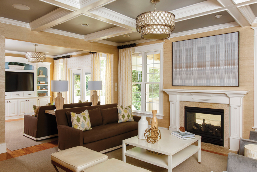
Serene palette and durable fabrics create a true family room.
Two dogs, two cats and four kids, two of whom have special needs. The life of the Colen family of Cary may be hectic, but their home most certainly is not.
“We rarely travel, so this house is our refuge,” said Hope Colen, wife to Gary and mom to Ben, 17; Nate, 15; Julia, 11; and Sydney, 7. “I like a clean look, and I don’t like clutter.”
To capture that look, and create a genuine family room, the Colens called on Lauren Burns, who earned an honorable mention vote from readers in Cary Magazine’s 2015 Maggy Awards, in the Best Interior Designer category.
NANCY PARDUE: What were the goals of this project?

The blue in the pillows is repeated in the bookcase paint, and the green in natural grasses. The pillow pattern is reflected in the drapes. Mixing high and low-end pieces helps keep a project on budget, notes designer Lauren Burns; for example, the wooden lamps are a Home Goods find.
HOPE COLEN: This space was previously a family room with a guest bedroom behind the wall. Our son Nate, who has autism, would self-segregate and stay in there watching TV. It was not the way we wanted our family to be together.
LAUREN BURNS: The family room was extremely dark and tight, furnished with a heavy, dark leather sectional. We tried adding a series of mirrors above the sectional to bring in light, but it wasn’t enough. My recommendation was to remove the wall to create a space with more natural light, which we accomplished by replacing the standard size windows with French doors.
Hope wanted a natural, earthy look with a bit of glamour. To avoid a ‘bowling alley’ feel in this long space, we created two separate, complementary seating groups: a casual space with floor poufs and TV, and a more sophisticated, adult space for conversation.
NP: Walk us through the details.

Today’s outdoor fabrics offer the feel of indoor and the durability needed by this family of six. Floor poufs add comfort for kids, and muted pattern for the overall look.
LB: The pillow fabric was the inspiration for the whole room. Other than the pillows and the metallic leather seats, everything you see here is outdoor fabric. Many people go to leather for durability, but today’s outdoor fabrics are much more comfortable and can create a beautiful space.
The gray armchairs are covered in high-end outdoor velvet made by Mariaflora of Italy, and the sofas are covered in a mid-range fabric with indoor trim added. You may spend a tiny bit more on outdoor fabric that feels like indoor, but will save on professional steam cleaning costs.
HC: It’s easy to keep clean; I use a bowl of warm water and soap!
LB: We also chose outdoor rugs; it’s often hard to tell the difference now between indoor and outdoor, and prices on these are coming down. The rugs add texture but not pattern, to allow the paint, pillows and two ceiling light fixtures to pop.
I recommend buying larger pieces in solids with some texture to them, and using patterns in small doses. Pillows, for example, are one of the most inexpensive items to update or change.
NP: The shapes in the pillows repeat in the neutral drapes, cornice box and chandeliers. Tell us about the color choices.

Carefully-chosen accessories help tie together the woods and metals used in this serene space.
HC: I would have never thought to use brown and gray together in the furniture, but Lauren pulled both of those colors from details in the pillow fabric.
LB: It’s all about balance — what do you want to pop? We painted the inside of the coffered ceiling gray, and kept it casual on the kids’ side with gray and ivory poufs that provide muted pattern.
We painted the back of the bookshelves a blue pulled from the pillow fabric, and added green with touches like the floor vases and natural grasses.
NP: What else?
LB: The artwork was meant for a corporate space I was working on, but its real home is here; the size, design and color are just right. To stay on budget, we mixed quality, timeless, high-end pieces with less expensive ones. For example, Hope found the wooden lamps at Home Goods.
The feel is lighter on the far end of the room to allow ample walkway into the kitchen, and we used just one side table between the gray chairs. People tend to overuse side tables. And the two-tier cocktail table easily hides items, providing extra storage space. It’s a lacquered piece that resists scratches, and ties the room’s woods and metals together.
NP: How do you like the results?

Designer Lauren Burns recommends choosing large pieces in solid colors with texture, and using pattern in small doses for easy, inexpensive seasonal swaps.
HC: The room is fun, inviting and welcoming, and I can see everything that’s going on from the kitchen sink. I love the grass cloth on the walls and how the chandeliers pull everything together.
Best of all is that Nate uses this room the most, and is much more part of the action now. Nobody sat here before, it was too dark, but now the kids love to play Mancala at the ivory table.
Lauren took my vision for a family room, and made it real.
Lauren Burns Interiors, Cary
(919) 699-8009
laurenburnsinteriors.com
laurenburnscollections.com
 |
 |
 |
 |
 |
 |
- These Dogwoods Beg for Attention
- Hanging Out at Home
- Exclusive Dish: Flavors Restaurant’s Cantaloupe Soup
- Restaurant Profile: The Mason Jar Tavern
- Cary Magazine Movers & Shakers: Barry Richburg
- Cary Magazine Movers & Shakers: Dr. Kevin Prue
- Cary Magazine Movers & Shakers: Apara Pochiraju
- Cary Magazine Movers & Shakers: Zankhna Parekh
- Cary Magazine Movers & Shakers: Joy Hughes Pantzer
- Cary Magazine Movers & Shakers: Karla Nantz
- Cary Magazine Movers & Shakers: Adam Mitchell
- Cary Magazine Movers & Shakers: Joshua Mauney
- Cary Magazine Movers & Shakers: J. Blake Massengill
- Cary Magazine Movers & Shakers: B.J. Lambdin
- Cary Magazine Movers & Shakers: Christina Kodesh
- Cary Magazine Movers & Shakers: Amanda Kimball
- Cary Magazine Movers & Shakers: Barak Henis
- Cary Magazine Movers & Shakers: Zaher El-Assi
- Cary Magazine Movers & Shakers: Paige Dick
- Cary Magazine Movers & Shakers: Kyle Denis
- Cary Magazine Movers & Shakers: Kenneth Combs
- Cary Magazine Movers & Shakers: Travis Wright Colopy
- Cary Magazine Movers & Shakers: Shawn Chase
- Cary Magazine Movers & Shakers: Adam Buchanan
- Cary Magazine Movers & Shakers: Martha Brown
- Cary Magazine Movers & Shakers: Jackie Bedard
- Cary Magazine Movers & Shakers: Mandy Becker
- Cary Magazine Movers & Shakers: Trey Bailey
- Cary Magazine Movers & Shakers: Daniel Whittaker
- Cary Magazine Movers & Shakers: Louis Vitiello Jr.
- Cary Magazine Movers & Shakers: Brigitte Specht
- Cary Magazine Movers & Shakers: Michelle Smith
- Cary Magazine Movers & Shakers: Christopher Saleh
- Camp Champs
- Wheels Up!
- A Perfect Summer


