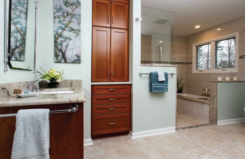
Beauty and function for aging in place
Think of it as a sign of maturity — the decision to adapt your home for aging in place.
“Most people don’t want to think about aging in place, but it makes sense,” said Jean Ehmke, owner and designer at JeanE Kitchen & Bath Design. “Planning ahead for accessibility allows you to remain at home, rather than relocate for recovery or for living.”
Ehmke, who holds degrees in both safety engineering technology and interior design, points to a recent master bath project at the Raleigh home of Bill and Jane Tucker, as an example of blending stylish form with practical function.

Left: Jane Tucker wanted side-by-side sinks, until Ehmke showed her the importance of separate sinks, with one you can wheel up to. HVAC vents located within the sink cabinetry prevent tripping hazards.
Right: Because the shower seat is made of concrete blocks covered with tile, instead of wood, the Tuckers don’t have to be concerned about wood rot. From the seat they can access a hand shower mounted on a grab bar that, like the tub and toilet, is ADA (Americans With Disabilities Act) compliant.
The Tuckers, both retired college professors, have been in their home for about 27 years, and embarked on the redesign to address their possible future needs. The project could pay for itself, they note, by helping them to avoid the costs of assisted living.
Nancy Pardue: How do you blend accessibility and safety with interior design?
Jean Ehmke: My approach is to think through the technical parts first, then work with the client to achieve the look they want, and bring the beauty to it.
This bathroom was designed using the National Kitchen and Bath Association Bathroom Planning Guidelines with Access Standards. The room’s original shape was unusual, and there was a hallway with doors to the closet, the bathroom, and even to the outdoor deck. There were step ups to a tiny shower and a tall whirlpool tub, which were hazardous, and double sinks.
We gutted the room and added studs for grab bars, replaced plumbing, and gained 5 feet of space by eliminating the hallway, which allows room for a wheelchair to turn around.
The original doorways to the bedroom and bath were widened, and the bathroom door was angled for use of a walker or wheelchair.

Left: The “before” toilet was replaced with an ADA-compliant model and relocated across the room for better accessibility. The decorative bar is one of several installed after the bathroom was gutted and studs were added.
Right: The shower and tub are combined into a roll-in wet area with a level entry. The shower has a linear drain with a high flow capacity, and a slight slope, so no curb is needed to catch water. The tempered glass panel gives the room a more spacious feel, while containing splatter, and the wall below serves as a handhold for balance.
What are your favorite features of the new space?
Jane Tucker: The shower is fabulous, and the cabinets are a great feature. Our floors are textured, non-slip, and heated underneath for comfort. And I love the windows! (With their home set on 3 wooded acres, privacy is not an issue.)
Bill Tucker: My wife had painted beautiful wildflowers on the bathroom wall, and I didn’t like having to give that up. Jean quietly had that section of the wall cut out and gave it to us, and now it hangs framed above the doorway.
NP: Walk us through some of the details of the space.
Jean: The shower and tub are combined into a roll-in wet area with a level entry; mosaic tiles are the visual cue that you’re entering a wet area. The shower has a linear drain with a high flow capacity, and a slight slope, so no curb is needed to catch water.
The shower’s tempered glass panel gives the room a more spacious feel, rather than bringing the wall up to the ceiling, and contains splatter. The height of the wall below it is deliberate, as a handhold for balance.
At the tub, you sit on the ledge, use the grab bar to swing your legs in, then use the handles inside the tub to lower yourself in. You reverse the process to get out.

For safer access into the bathtub, you sit on the ledge, use a wall-mounted grab bar to swing your legs in, then use the handles inside the tub to lower yourself.
The comfort height toilet, for ease of use, the bathtub and the hand shower mounted on a grab bar are all ADA (Americans With Disabilities Act) compliant.
The bathroom’s cherry cabinetry is from Bremtown, one of the lines I carry, and the countertops are granite. The room is well-lit with LED lighting, and a heavy-duty exhaust fan draws out as much steam and moisture as possible.
NP: What should people consider in an aging in place project?
Jane: Think about the essentials, then what’s nice to have. For example, a shower was essential, a large shower is nice, and a large shower with a large window is wonderful!
Also, use a designer, even if you hire by the hour. They think of things you never would. It was Jean who insisted on making room for a wheelchair to turn around. And I wanted the two sinks together like before, but she showed us the importance of separate sinks, with one you can wheel up to. Jean interviewed contractors with us too, as our advocate.
Jean: The primary goal is to have an accessible home that also looks nice. Think about the whole house, what allows you to move about easily, with your pathways and doorways accessible.
A designer can save you money in the long run, by showing you options and how to prioritize. If you work with a designer you make a plan, get cost estimates, then tweak the plan to get the most out of it.
To completely gut a room like this one, expect to spend a minimum of $25,000. And that budget can fluctuate very widely depending on your fixture, tile and cabinetry choices, and other details. You have to decide where you want to put your money.
Jane: This project was absolutely designed to a ‘mature age.’ We knew it needed to be practical and safe, but Jean made it look like a spa! It makes me feel great every time I walk in.
Jean Ehmke
JeanE Kitchen and Bath Design Inc.
(919) 656-0373
jeanekandbdesign.com
 |
 |
 |
 |
 |
 |
 |
 |
 |


