When Vito and Elizabeth Guarnaccia contacted Cary architect Dawn Christine, their goals were fairly modest.
They wanted a better breakfast nook, and because they entertain frequently, they wanted a sunroom to transition from their kitchen to their deck. They were also thinking their recently updated kitchen could be brighter.
When Christine entered the Cary home, she immediately noticed what her clients hadn’t — how they moved through their home.
“I’m thinking not just about each individual room, but how everything connects and flows,” said the architect, who has been in the field for 18 years, launching her eponymous firm four years ago.
After looking at three alternatives, the Guarnaccias went with the most elaborate design. The 2014 renovation included expanding and redesigning the kitchen, adding a four-season sunroom, and creating a mudroom with a walk-in pantry and laundry.
We spoke with Christine about creating a beautiful and more functional space for her clients.
What were the goals of the project?
They have this beautiful foyer, but hardly ever does anyone come in through their main entry. Everybody comes through the garage. I took one look at this, and I thought: “They’re coming in and out through here. We need to fix their main experience as they come and go from the house.”
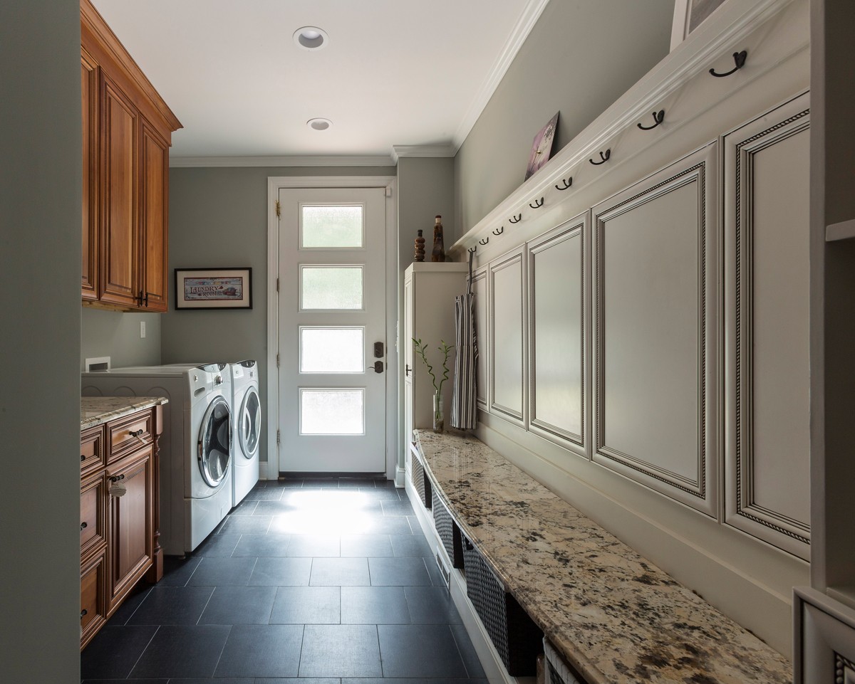
When they came in, they were crammed into a coat closet and a tiny laundry room.
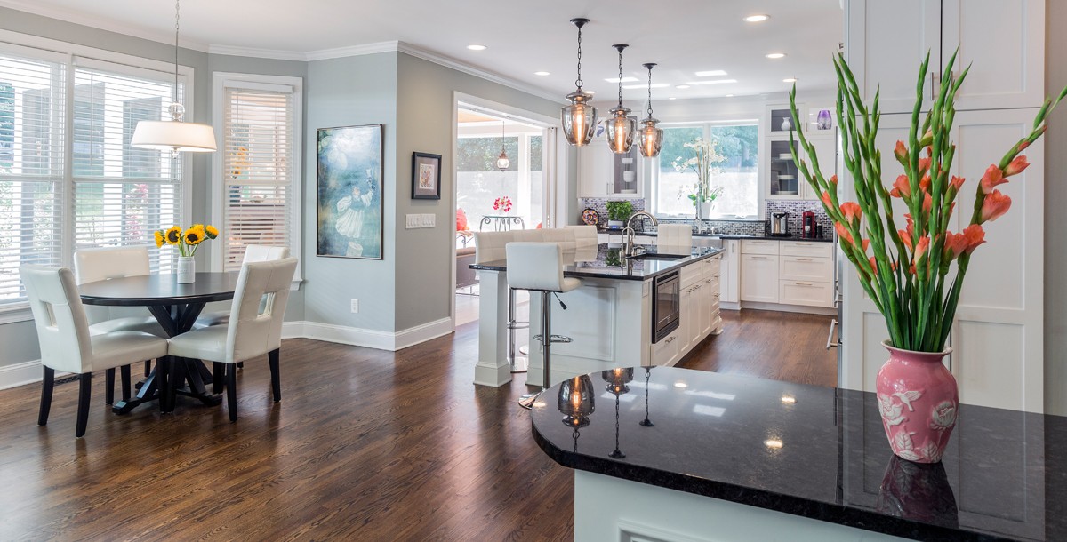
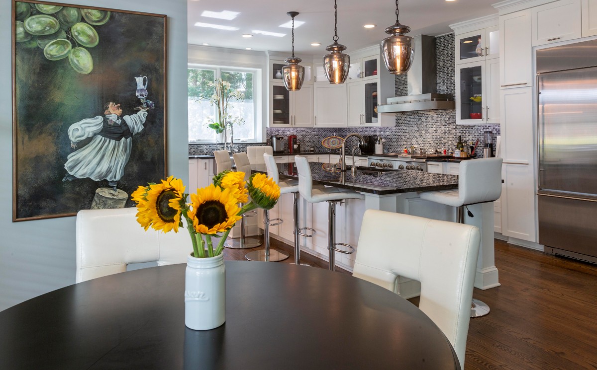
Spatially there were also problems. You couldn’t get a table in the breakfast nook, and once you did, you couldn’t really get in and out to the deck. It was too crammed.
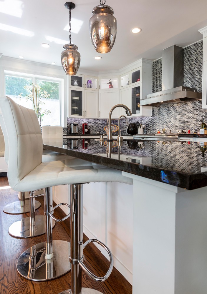
The other issue is that it was pretty dark, even though there were windows. So, I put in a focal point window with a thickened sill, so Elizabeth could put plants or flowers or herbs there. And it really brightens the space, having that window at the end.
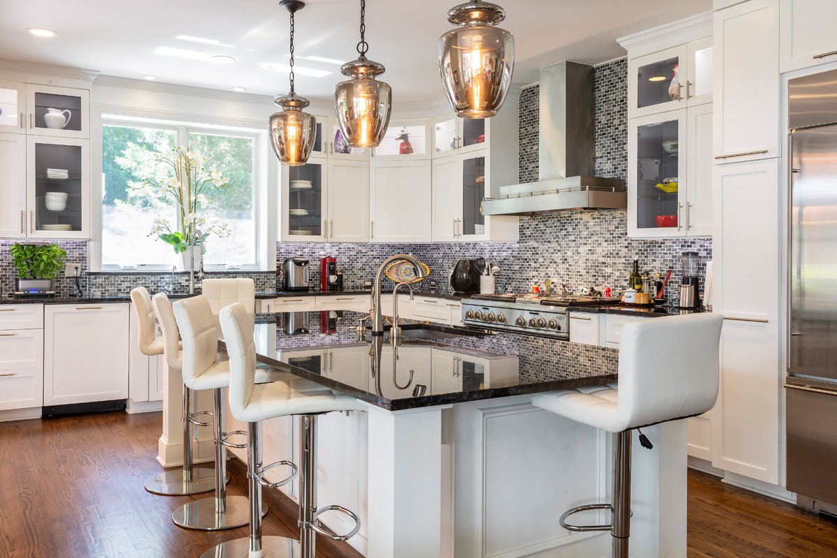
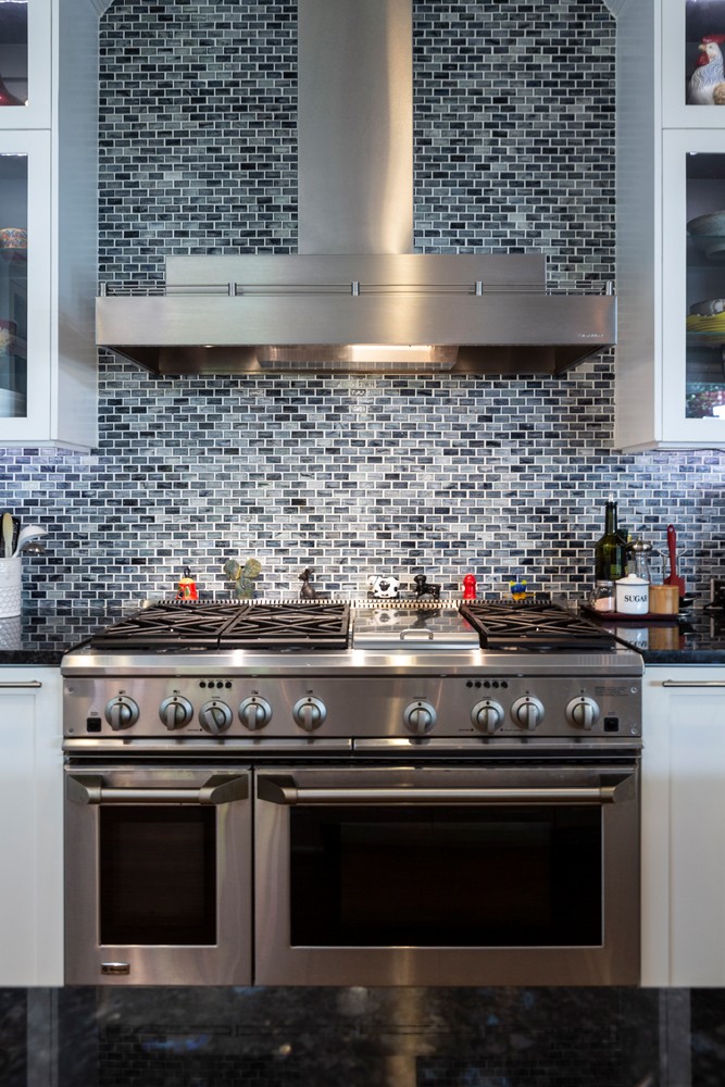
They were wanting a brighter kitchen; they wanted to change its look and feel. They didn’t necessarily see all the things that I saw once I got into it.
How does the new design improve its functionality?
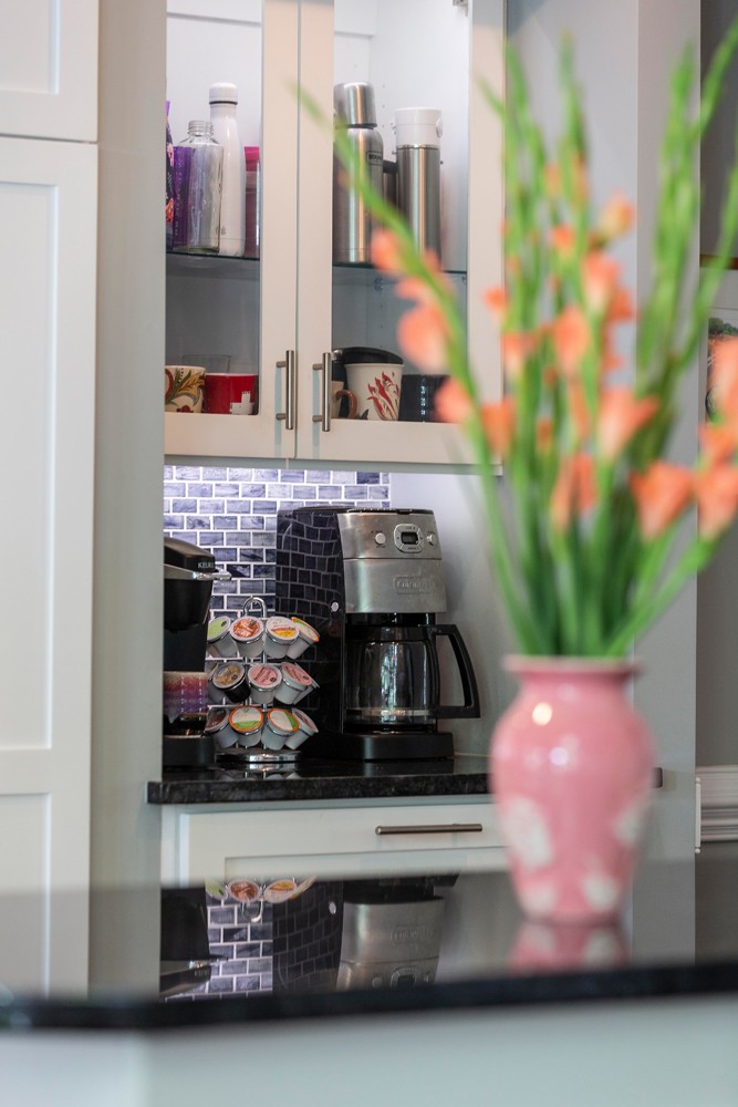
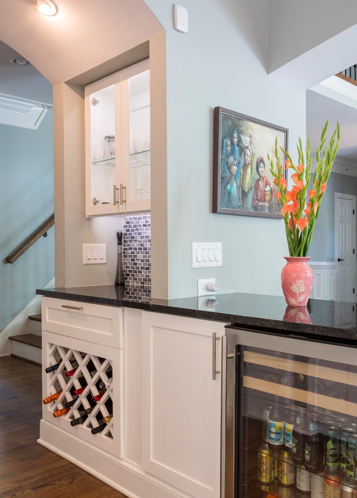
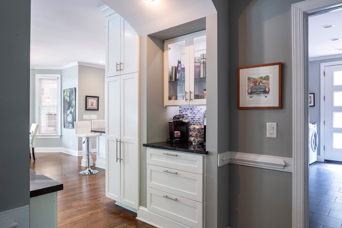
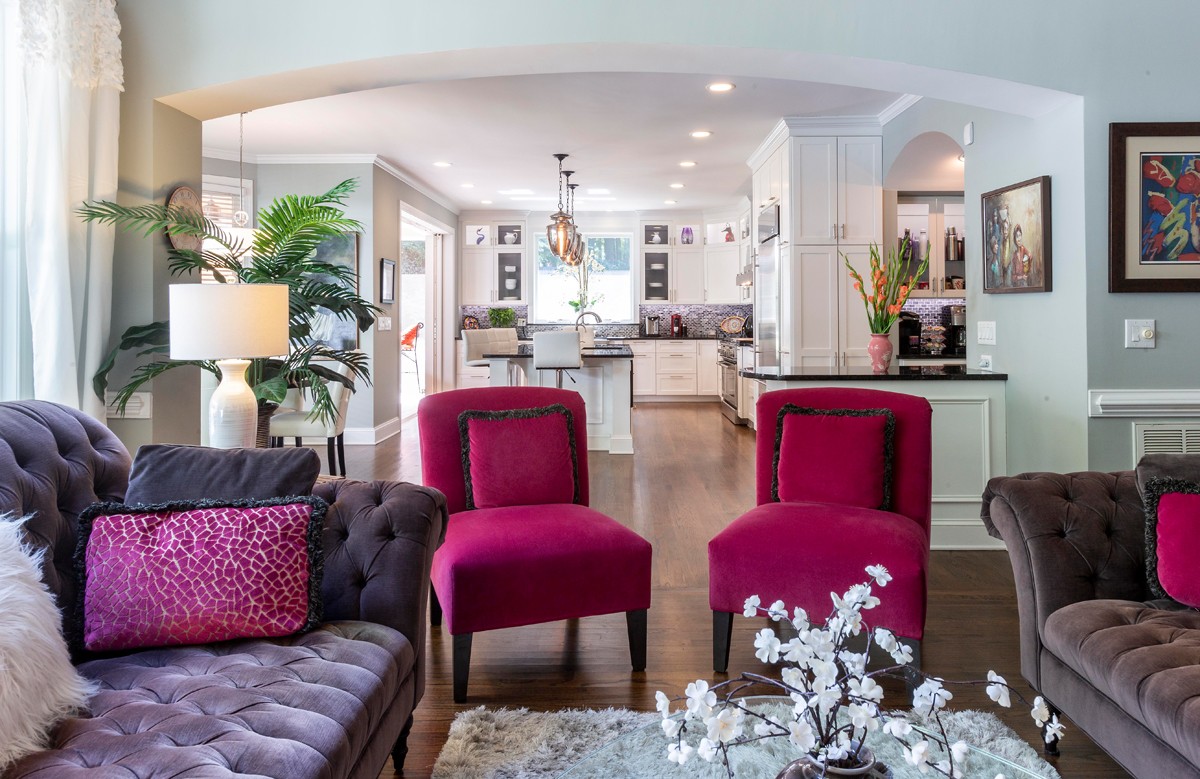
Now when they come in, they’ve got their coffee center on one side and bar on the other. Even when they come down the steps from their bedroom, or they’re coming in and out, this archway frames the opening as they look out. From the garage, it’s a straight vista outside.
The breakfast nook utilizes their existing space, but now functions better, because the traffic flow is addressed with the kitchen design and the outdoor access. Part of a good design is continuous flow between indoor and outdoor spaces. It’s not just about creating the spaces, it’s how you get to it and get to the next one.
What were some of the challenges of the project?
One of the biggest obstacles was the roofline. Because we had a second floor above, and the master bedroom sits above where the existing kitchen was, any roofline had to sit below those windows. We didn’t want to start changing things upstairs.
The secondary challenge was, we could get the roofline to work a little easier if we used a metal roof. But metal roofing material is like, 10 times the cost of asphalt shingles.
You need a certain amount of slope to use shingles, but if you can’t get enough slope because of distance, then you have to go with a flat-roof material.
I was able to design the roof to get enough slope for shingles on the majority of it, but it took a lot of three-dimensional modeling to figure those geometries out and minimize the costs of the finished roof and not affect those windows upstairs.
What was your inspiration?
For all of my projects, my clients are my inspiration. I’m not designing based on current trends, I’m designing based on design principals that should last.
What are some favorite features of the completed project?
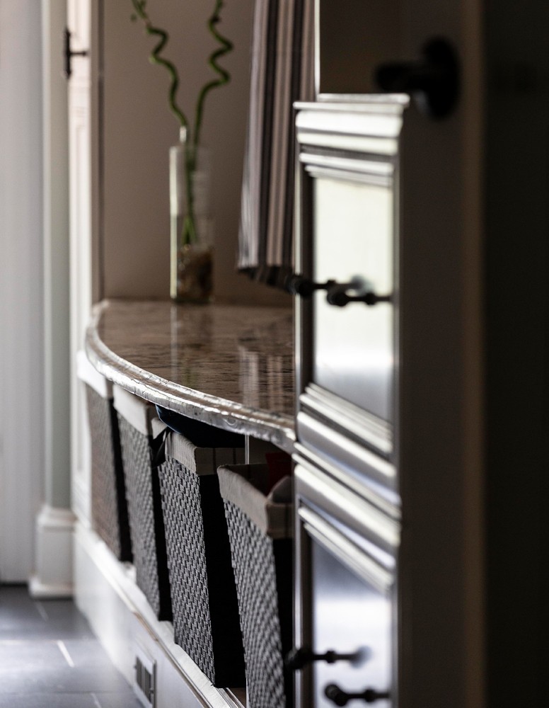
Mudroom: They had just renovated their kitchen five years prior to hiring me, with Kitchen and Bath Gallery. They did a great job, the cabinets are beautiful, which is why I took the time to measure and try and incorporate as many as I could in the mudroom/laundry room area.
The back of the island is the wainscoting that is in the mudroom. We reclaimed those. I measured all the existing cabinets and played Jenga. How can I make them fit? How much can we save?
Beverage Center: When you’re entertaining, where does everybody congregate? The kitchen, around the food. So, when people want drinks, everyone is on top of each other. I always design them as separate entities, so the traffic will flow around the beverages and will flow around the food.
Again, it’s experiential. It functions every day to be able to come down and grab your coffee, grab a beer when you get home. I’m creating the everyday experience and then the entertaining experience.
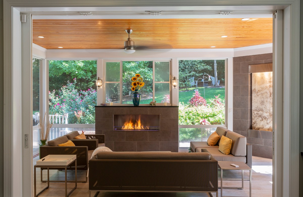
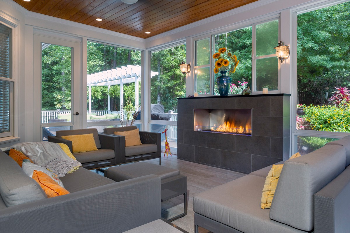
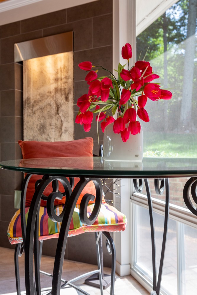
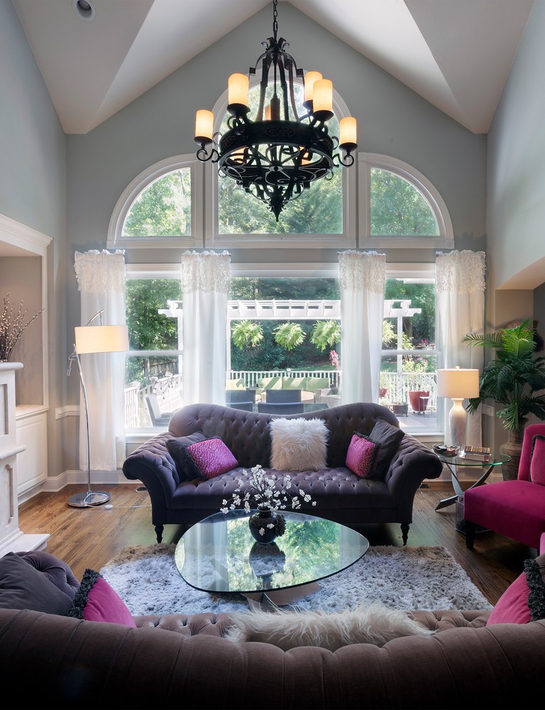
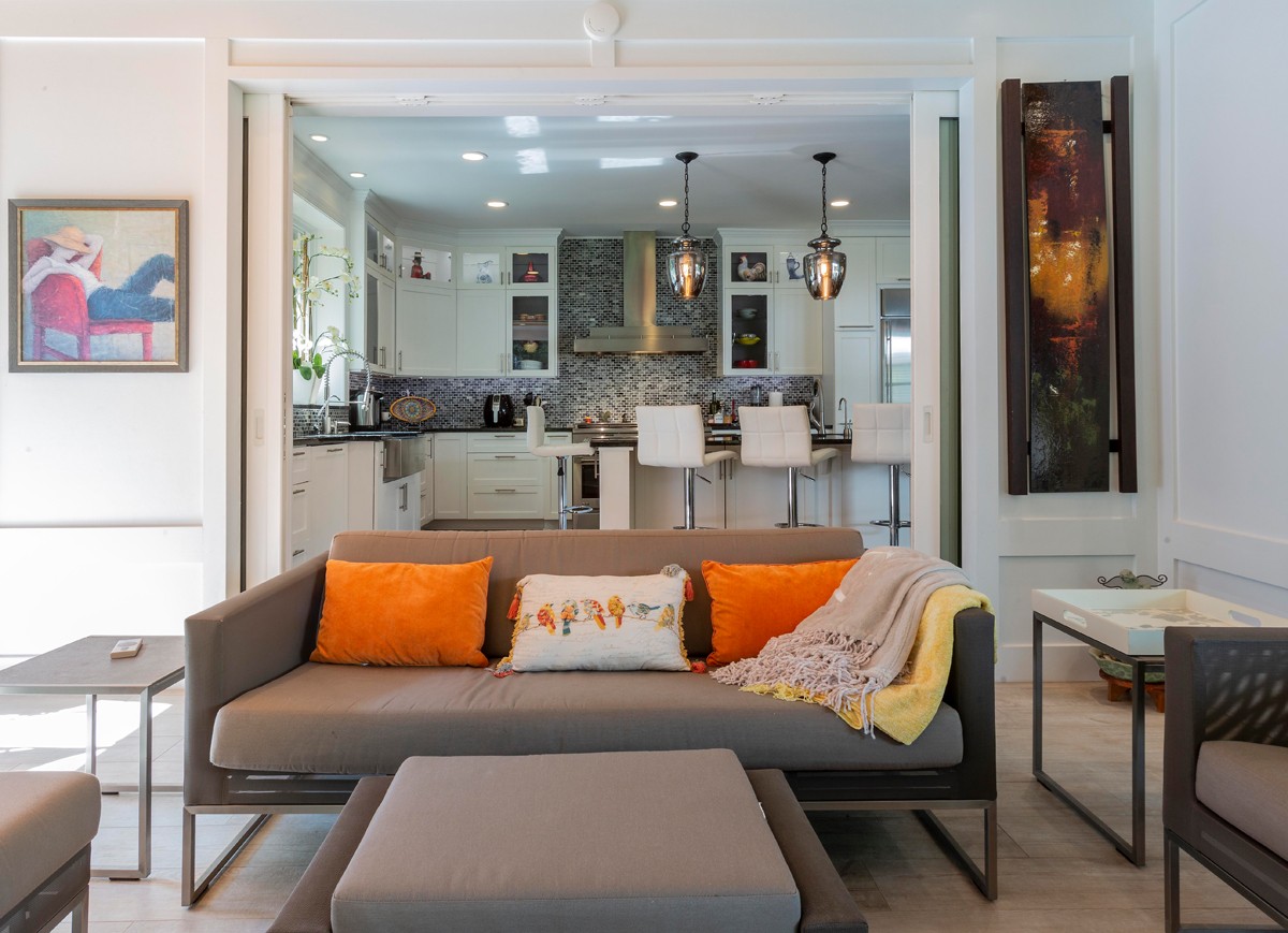
Sunroom: It’s not conditioned, yet it is four seasons, because the fireplace throws out so much heat in the winter, it’s warm out there.
The Eze-Breeze panels keep the pollen out, so you don’t have to deal with the cleaning up. That’s one thing everybody hates to do. It’s a vinyl material, and it’s very durable.
Another feature of this room is the doors pocket into the walls, so when they’re opened this outdoor space really looks and feels like it’s part of the heated, conditioned space.
Dawn Christine Architect
701 E. Chatham St., Cary
(919) 377-1227
dawnchristine.net
- Take a Bough
- Discover Hillcrest
- Going Through a Phrase
- A Cut Above
- Dive into Adventure at the Greensboro Science Center
- Nonprofit Spotlight: Team Drea
- Worth the Drive: On the Square in Tarboro
- Key Lime Gose from Durty Bull Brewing Company
- Port Cask Finished Virginia-Highland Whisky from the Virginia Distillery Co.
- Home Tour: Light and Bright
- Small Business Spotlight: City Garden Design
- Garden Adventurer: It’s Tatarian Aster Time!
- From the Editor: October 2019


