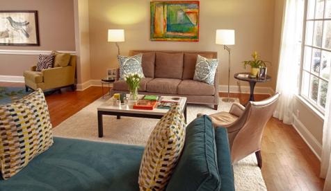
After 15 years of living with “late ’80s builder grade” Terri Zacco was ready for an update. An unused formal dining room, cramped entryway and outdated kitchen made way for practical and pretty spaces that serve her family’s needs much better. Overwhelmed by the scope of an entire first floor remodel, Zacco sought help from Designer Brittany Ruch of Design Lines to achieve a look that marries form and function.

Emily Uhland: How did you get started with the remodel?
Terri Zacco: I needed furniture so badly, and I refused to buy anything until I figured out what I was going to do with the whole plan. When I met with Brittany, it felt really natural with her. She and I clicked right away, and she made it very easy for me. We took it at a slow pace, for me, because there were so many things to pick out and so many decisions to make.
Brittany Ruch: The entire first floor is the project. We went in with new hardwood flooring, blinds on all the windows — this cool natural material — furniture everywhere and a completely new kitchen.
Emily: What were the motivations behind the changes?
Terri: Everything was exactly how it was built — late ’80s style, all builder-grade everything. The formal dining room never got any use at all. I hated it for that purpose. I had been wanting to do it for years and years, so I just started saving up the money. And I’m glad I did.
Brittany: It was all about concealment and organization whenever we could. There are lots of spaces to hang out or work causally or be on a computer, which I think works well for a modern family.
Emily: What is your favorite element of the new space?
Brittany: My favorite transformation is the foyer. I think we created a sense of entry by changing up the flooring material. There’s this wood border all the way around it. It’s tile but it looks like slate. There’s a drop zone area with a bench and hooks for coats.
Terri: The kitchen is my favorite part. I love to cook when I have the time. The space she’s provided with the island and the seating on the other side is great. The backsplash is blingy and shiny. I love it.
Brittany: We really utilized the concept of an island, and then Terri would have multiple spaces to work. Instead of just a one-cook kitchen, she is the cook, but everyone can help her this way. We put away her toaster oven and microwave in a built-in area. It feels integrated; nothing is out on the counter that doesn’t need to be there.
Emily: How would you describe the style?
Terri: Pretty. I wanted it to be classic and timeless. Right down to the fabric choices, pieces were chosen to be easy to care for and fully functional.
Brittany: Colorful, classic and casual modern. The art was thoughtfully chosen and selected by her. Terri found some of the accessories, and I think that’s important. So you don’t have everything that’s all new. I think it’s good to live with your space and see what you need. I think that’s a way that clients can bring in their personality, and it can be a blend of your styles.
Emily: How did you incorporate color into the design?
Brittany: The kitchen has a lot of ivory going on. The cabinets are ivory and the chairs are done in an ivory leather. So then it can serve as a neutral envelope to hold the pops of color. I knew Terri liked bright colors, but because the space was so open we had to use it carefully, so that it wouldn’t take over. I love to use color, but I often see the people, or the clients, as the color in the space.
View the before and after photos in the gallery at right.
 |
 |


